Introduction
Sources are not found. They are made.
Throughout our academic careers, we are taught that factual claims require sources. This is necessary discipline, but repeated often enough, it can harden into dogma: if something is not sourced, it does not exist, while attaching an authoritative citation seems to grant it legitimacy. Citation consequently becomes a stopping point. Once the source has been located, the inquiry is presumed complete.
That instruction never answered the question it provoked. Why should an article, database record, or credentialed author count for more than my own observation?
The usual response returns to a familiar set of criteria. The article was peer-reviewed. The record came from a scholarly database. The author possesses relevant credentials. The publisher is reputable. Such criteria are useful, but they identify signals of authority rather than explain how that authority was earned. Directing someone toward another credential, institution, or publication only moves the question backward.
The problem was never the demand for evidence. It was the expectation of deference without explanation. “Trust this source” is not an argument. If research education is intended to cultivate inquiry, then authority should withstand the same question asked of every other claim: why?
Something, somewhere, must create it.
Since questioning produced no satisfactory answer, the sensible path was to select a finished source and follow it upstream, not unlike tracing a river to its headwaters. Water provided an ideal subject because the interest was already personal. Whitewater kayaking, search and rescue work, winter hiking, and rock climbing all demand preparation. Physical training and proper equipment matter, but awareness often matters more. Weather and streamflow can determine whether an outing is routine, impossible, or fatal. Runoff and flow also carry broader environmental significance, providing information about watershed conditions, water availability, drought, flooding, land use, and long-term climatic patterns.
This combination of personal relevance and public importance led me to Streamflow: Computed Runoff for Water Years Within the Commonwealth of Kentucky, a longitudinal dataset published through WaterWatch by the U.S. Geological Survey (USGS, n.d.-a). On its face, the collection is unremarkable. Each row contains a water year, a runoff measurement, a rank, and a percentile. Its apparent simplicity is precisely what makes it useful for this investigation. Finished data conceal the considerable machinery required to produce them.
Rather than treating the USGS table as an endpoint, this analysis follows it backward. Published documentation, comparative data from the United Kingdom’s National River Flow Archive, direct observation of USGS equipment and facilities during a site visit, and an extended semi-structured interview with Peter J. Cinotto, Branch Chief for Operations and Associate Director for Kentucky, provide complementary views of the process. Together, they show how environmental conditions become measurements, how measurements become certified records, and how those records become public information.
The resulting workflow challenges the assumption that an authoritative source is trustworthy because human judgment has been removed from it. Human judgment is present at every stage. Credibility instead emerges because that judgment is disciplined through calibration, redundancy, comparison, documented correction, professional review, and a visible distinction between provisional and certified data. The source is not the natural world reproduced without mediation. It is a defensible record of that world, created through an accountable process.
Case Selection
Created by Congress in 1879, the U.S. Geological Survey serves as the science arm of the U.S. Department of the Interior. Its work encompasses the collection and distribution of earth, water, biological, and mapping information used to inform decisions involving the environment, natural resources, and public safety. The agency summarizes this mission through the phrase “science for a changing world” (USGS, n.d.-b).
Official status explains the agency’s reach, but it does not by itself explain why anyone should believe a particular USGS record. The agency generally does not regulate the resources it studies or determine the policies its data may later support. Instead, its influence depends on whether policymakers, resource managers, scientists, emergency planners, and members of the public regard its information as sufficiently accurate, durable, and impartial to support decisions. These stakeholders may rely on the same measurements while holding different, or even competing, interests.
That institutional position makes the USGS particularly useful for examining how a source acquires legitimacy. Government affiliation may confer an initial presumption of authority, but the continued usefulness of its data depends on something more substantial. Collection methods must withstand environmental conditions, measurements must survive technical and professional scrutiny, errors must be identified and documented, and the resulting records must remain intelligible to people outside the agency. Examining how the USGS meets those requirements provides an opportunity to distinguish authority that is merely asserted from authority that is procedurally earned.
Collection
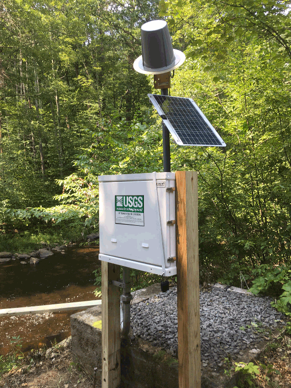
For water measurements, the USGS relies on automated streamgages placed at strategic points along waterways. Available systems include float assemblies, submerged pressure transducers, acoustic instruments, noncontact radar, and bubbler gauges. Of these, the bubbler is the most commonly used. While instrumentation, recording, and transmission have evolved to take advantage of digital storage and networking, the basic streamgaging operation – measuring stage at a fixed location and converting it into discharge through a site-specific relationship – has remained largely unchanged since the late 1800s (Nielsen & Norris, 2007).
Each bubbler station uses an air pump or compressed gas reservoir connected to a small hose routed to the streambed. Measurements are recorded at regular intervals, typically every 15 minutes. During operation, air is forced through the hose, roughly equivalent to blowing bubbles through a drinking straw. Increasing water depth produces a corresponding increase in pressure and resistance to the airflow. Measuring the pressure required to release bubbles from the submerged opening therefore produces a measurement of river stage.
This method may seem needlessly indirect. Why not simply place a level gauge in the water? Accuracy and resilience. Water is not a neutral medium: surface turbulence resists consistent measurement; currents distort readings and batter equipment; prolonged immersion inevitably degrades instruments. The bubbler gauge translates water depth into air pressure, allowing instrumentation to remain well outside the river. Only the opening of the hose must be submerged. This arrangement offers several practical advantages:
- Robustness – The compressor, pressure sensor, recording equipment, power supply, and transmission equipment can be mounted safely beyond the river’s reach in a single, sturdy housing. Sensitive components remain protected from water, debris, sediment, ice, and the physical forces produced during major flow events. The only submerged portion is a hose with no moving parts, making it resistant to physical damage and impervious to water degradation. The enclosed unit can also safely house battery backup, allowing measurement to continue during electrical outages, including the extreme weather events when streamflow information becomes most important.
- Self-maintenance – Because the system exhausts air through the hose rather than drawing water into the apparatus or passing it through an immersed sensor, the forced airflow helps clear sediment, organic material, mineral scale, and other accumulations from the opening. This gives the system a degree of self-maintenance and reduces the manual cleaning required by many immersed instruments.
- Measurement range – Unlike a fixed gauge whose scale may be exceeded or a float constrained by mechanical travel, pressure-based measurement can accommodate substantial changes in water level without requiring an immersed device to move with it. The same operating principle remains useful during heavy floods and severe droughts.
- Serviceability – Because the instrumentation can be placed a considerable distance from the submerged hose, devices can be installed in more accessible locations, such as on bridge rails or piers near roadways. This gives technicians simpler, safer access for inspection and maintenance. When failures do occur, the simple design allows units to be swapped or fixed quickly with minimal service interruption.
River stage, however, is not the same as streamflow. Stage records the height of the water at a particular location. Converting that observation into discharge requires a rating curve developed from measurements of channel dimensions and water velocity. Technicians repeatedly measure the stream at different stages to establish the relationship between water height and flow. The resulting curve allows each recorded stage value to be expressed as an estimated volume of water passing the station over time.
This distinction provides the first example of how the source is made. The instrument does not directly observe streamflow. It observes pressure. Pressure becomes stage, and stage becomes discharge through an established mathematical relationship. What eventually appears as a simple flow value has already passed through several layers of instrumentation, calculation, and human construction.
Flow rates are typically expressed in cubic feet per second (ft³/s) or cubic meters per second (m³/s). One cubic foot contains approximately 7.5 gallons, while one cubic meter contains 1,000 liters – roughly the volume of a large household refrigerator. Discharge values can then be aggregated across time and related to drainage area to estimate runoff.
To give these numerical values some human scale, consider the Licking River. Flowing into Cave Run Lake and continuing below its dam, this tributary of the Ohio River extends approximately 488 kilometers – about 303 miles – from southern Magoffin County to the Ohio River directly across from Cincinnati (Strickler, 2026; U.S. Army Corps of Engineers, 2024). Its basin covers approximately 3,700 square miles – roughly 9,600 square kilometers – across 22 counties (Carey, 2009). Medium-sized within its region and serving as a second-tier waterway in the larger drainage system leading to the ocean, the Licking is substantial in its own right. At the Alexandria station near its mouth, the approved daily record available through May 3, 2024, yields a mean discharge of approximately 163 m³/s (USGS, 2024). Compared with the Ohio River it feeds, however, it is little more than a trickle.
Yet that “trickle” carries enough water to fill an Olympic-size swimming pool approximately every 15 seconds. Given a hydraulic head of 20 meters, the flow represents approximately 32.0 megawatts of theoretical hydraulic power – about 43,000 horsepower. Using the EIA’s 2022 average of 10,791 kilowatt-hours per residential utility customer per year, this represents the average electrical demand of roughly 26,000 such customers (U.S. Energy Information Administration, 2024). The same power is comparable to the full rated output of roughly ten diesel locomotives.
Kentucky presents a challenge of scale. The Commonwealth possesses more kilometers of running water than any state except Alaska (Kentucky Commission on Military Affairs, n.d.). P. J. Cinotto (personal communication, March 21, 2024) reported that the USGS collected measurements from 258 stations distributed throughout Kentucky, providing a granular assessment of its major watersheds.
Nearly all of Kentucky’s major watersheds belong to the Ohio River watershed, other than a relatively small portion of western Kentucky that drains directly toward the Mississippi River. The Ohio River is not only the largest tributary of the Mississippi by volume; it carries approximately 35% more water than the Mississippi at their confluence – an average discharge of 7,960 m³/s compared with 5,897 m³/s (Van der Leeden et al., 1990). In volumetric terms, the Mississippi is therefore the tributary and the Ohio is the true main stem of the river system. This makes nearly all of Kentucky’s major watersheds, including the previously noted Licking River, second-tier oceanic drainage systems with far-reaching environmental ramifications.
No single instrument measures Kentucky runoff. The published dataset combines observations from a distributed network, applies station-specific rating curves, relates the resulting discharge values to drainage area, and aggregates them across time. Station placement determines what can be observed. Rating curves determine how pressure becomes stage and stage becomes flow. Aggregation determines how local measurements become a statewide record. Collection is therefore not the passive acquisition of facts. It is the first consequential stage in making the source.
Data
The finished dataset is presented in a simple table. Each row represents one Kentucky water year, beginning in 1901 and continuing through water year 2023. Under USGS convention, a water year begins on October 1 and ends on September 30, taking the number of the calendar year in which it ends (USGS, n.d.-a). See the following sample:
| Region | Year | Runoff (mm) | Runoff (in) | Rank | Percentile |
|---|---|---|---|---|---|
| KY | 1901 | 578.24 | 22.77 | 31 | 75.00 |
| KY | 1902 | 536.85 | 21.14 | 44 | 64.52 |
| KY | 1903 | 694.83 | 27.36 | 11 | 91.13 |
| KY | 1904 | 331.53 | 13.05 | 104 | 16.13 |
| KY | 1905 | 346.66 | 13.65 | 98 | 20.97 |
| KY | 1906 | 471.94 | 18.58 | 70 | 43.55 |
For each water year, statewide runoff is expressed in millimeters and inches. These are not separate observations, but different units describing the same derived value. Expressing runoff as depth converts water volume across a large and irregular drainage area into a standard quantity. Kentucky’s 578.24 millimeters of runoff in 1901, for example, represents enough water to cover the measured area to a uniform depth of 578.24 millimeters, or 22.77 inches.
The fields for rank and percentile initially caused me some confusion because the table provides no immediate context for either. Did rank compare Kentucky with other states, or actual runoff with a projected total? Comparison across the rows reveals that both fields relate each water year to the other years within the Kentucky record. Rank orders the years from greatest to least runoff, while percentile expresses the percentage of recorded years with lower runoff. The 91.13 percentile assigned to 1903 therefore indicates that its runoff exceeded approximately 91% of the annual values in the series. These fields thus provide an immediate indication of which water years were unusually wet or dry.
Most importantly, the apparent simplicity of the runoff field should not be confused with direct measurement. No instrument observed 578.24 millimeters of “Kentucky runoff.” Individual streamgages observed river stage at specific locations. Those local observations were converted into discharge, related to drainage areas, and aggregated into a statewide annual estimate. The table is straightforward because its complexity has already been resolved through the stringent source-creation workflow examined further below.
The dataset carries no personal byline. Its authorship is institutional and cumulative, representing successive generations of technicians, scientists, administrators, and developers. Likewise, the absence of rows before 1901 does not mark the beginning of USGS stream measurement, which predates this particular series. It marks the historical boundary selected for this statewide comparative product.
Stable presentation connects observations made by different people, instruments, and transmission systems across generations. The continuity is evolutionary rather than static: personnel and technologies change while the governing measurement process and public data structure persist.
Each six-field row is therefore an extraordinary reduction. Millions of local observations, equipment cycles, mathematical conversions, comparisons, corrections, and professional decisions become one annual statement about Kentucky. This compression makes 123 years mutually comparable while concealing nearly every process required to produce them. The finished source appears simple because its construction is no longer visible.
Comparative
Because another collection produced by the USGS would reflect the same national practices, meaningful comparison requires a similar source from outside the United States. The USGS pioneered many methods later used by counterpart agencies, making an institutionally independent one-to-one equivalent difficult to find. Before selecting the United Kingdom’s National River Flow Archive (NRFA), I reviewed several of the closest candidates.
- Water Survey of Canada (WSC) – The WSC was the closest procedural match, but I rejected it because Canada occupies the same continent as the United States, while the WSC exchanges information and methodology directly with the USGS. These similarities reduced its usefulness as an independent comparison.
- Australian Bureau of Meteorology (BOM) – The Australian Water Resources Information System (AWRIS) offered a query interface similar to the USGS dashboard. Australia, however, centralized its national water data under its weather agency, while the USGS is organized as a geological survey. This institutional difference ultimately made the United Kingdom’s NRFA a stronger candidate.
- Bureau de Recherches Géologiques et Minières (BRGM) – France’s BRGM maintains water-related records, but its institutional purpose and procedures differ substantially from those of the USGS. The language barrier would also have introduced additional friction.
The NRFA is administered by the UK Centre for Ecology & Hydrology, but its records originate from gauging networks operated by several measuring authorities, including the Environment Agency, Natural Resources Wales, the Scottish Environment Protection Agency, and the Department for Infrastructure in Northern Ireland. Its institutional structure therefore differs from the USGS model. USGS collection, certification, storage, and publication are primarily contained within one federal agency. The NRFA instead consolidates measurements supplied by multiple public organizations into a common national archive. Both arrangements produce authoritative records, but they establish authority through different organizational paths.
Unfortunately for direct regional comparison, the NRFA interface does not provide a single region-wide runoff download comparable to the USGS Kentucky table. Records are organized around individual gauging stations and must be retrieved station by station. The NRFA also acknowledges that its gauged daily flow records average around 40 years in length, though roughly 370 stations extend beyond 50 years. Some longer series incorporate less formal historical records, while changes in measurement methods, station locations, water use, and other human influences may complicate their interpretation (NRFA, n.d.).
The following sample contains the gauged daily mean flow recorded at Snaizeholme Beck at Low Houses on the first day of each month during 1967, the first full calendar year covered by the record. Retrieving the data requires completing a short request form and accepting a disclaimer, after which the NRFA supplies the results in CSV format (NRFA, 2023). I have made the full downloaded dataset available here.
| Date | Gauged daily flow (m³/s) |
|---|---|
| 1967-01-01 | 0.41 |
| 1967-02-01 | 1.13 |
| 1967-03-01 | Missing (M) |
| 1967-04-01 | 0.85 |
| 1967-05-01 | 0.11 |
| 1967-06-01 | 0.1 |
| 1967-07-01 | 0.08 |
| 1967-08-01 | 0.35 |
| 1967-09-01 | 0.76 |
| 1967-10-01 | 3.46 |
| 1967-11-01 | 0.89 |
| 1967-12-01 | 0.22 |
The downloaded NRFA record expresses gauged daily mean flow in cubic meters per second. Unlike the USGS Kentucky table, it reports discharge at one station rather than runoff depth aggregated statewide. The record also includes no rank or percentile fields. Such comparisons may be calculated after retrieval, but they are not built into the published time series.
One remarkable difference is the granularity of the data points. The USGS table reduces statewide runoff to one value for each water year. The NRFA record provides one daily mean discharge value at an individual gauging station. One USGS row therefore represents an entire state across one year, while one NRFA row represents flow past one station across one day.
This structural difference changes what each source makes immediately visible. The USGS table permits direct comparison across 123 water years, with rank and percentile already calculated. The NRFA record preserves temporal movement within individual years, allowing sequences of rising, sustained, and declining flow to remain visible. Both originate from continuous local observations, but each archive presents them at a different geographical and temporal scale.
The NRFA daily value is itself a derived product. Recorded stage is converted into discharge through the station’s established rating relationship and summarized as a daily mean. The value is neither normalized to catchment area nor combined into regional runoff. The USGS product continues through statewide aggregation, annualization, ranking, and percentile calculation. The NRFA product stops at the daily station series and leaves regional aggregation or historical ranking to the user.
Source structure therefore communicates institutional priorities before any written interpretation begins. The USGS format foregrounds broad historical comparison. The NRFA format foregrounds local temporal change. Each makes one family of questions easy to ask while requiring additional work to ask the other. Similar environmental observations consequently become meaningfully different sources through decisions about geographical scope, temporal resolution, aggregation, and presentation.
Uses
Publication by the USGS is not the end of the data’s lifecycle. Other government agencies use USGS records as inputs for their own research, analysis, and public communication. One example appears in the U.S. Environmental Protection Agency’s Climate Change Indicators: Streamflow (U.S. Environmental Protection Agency [EPA], 2021).
For this indicator, the EPA returns to long-term USGS streamgage records and constructs a different statistical product. Rather than comparing statewide annual runoff, it identifies the lowest average streamflow sustained across seven consecutive days during each year. Changes in this annual low-flow measurement are then calculated across the period from 1940 through 2018 and presented geographically.
Figure 1
Seven-Day Low Streamflows in the United States, 1940-2018
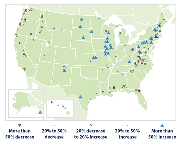
Note. From Climate Change Indicators: Streamflow, by the U.S. Environmental Protection Agency, 2021. Data derived from USGS streamgage records.
The visualization reduces decades of station records to a compact visual vocabulary. Downward brown triangles indicate decreasing seven-day low streamflows, while upward blue triangles indicate increases. Marker size represents the magnitude of change. Open circles identify stations whose estimated change remains between a 20% decrease and a 20% increase.
The resulting pattern is regional rather than uniform. Seven-day low streamflows generally increase across much of the Northeast and Midwest, with several stations showing gains greater than 50%. Decreases appear more frequently in portions of the Southeast and Pacific Northwest, including several stations where low streamflow falls by more than 50%. Numerous stations across the country remain within the central range.
These measurements describe conditions during the lowest-flow portion of each year. Increasing values indicate that more water remains in a stream during its annual low period. Decreasing values indicate that the low-flow baseline has diminished, with consequences for water availability, habitat, water quality, agriculture, and other systems that depend upon sustained flow.
The EPA’s choice of measurement changes the question being asked. The USGS Kentucky table asks how total statewide runoff during one water year compares with other water years. The EPA visualization asks whether the lowest sustained flow at selected stations has changed across several generations. Statewide aggregation and station-level trend analysis originate from the same measurement infrastructure, but produce different forms of knowledge by selecting different geographical scales, periods, and statistical operations.
This is also a visible example of institutional source creation. The USGS determines where streamgages are placed, collects their observations, converts stage into discharge, and certifies the resulting records. The EPA then selects qualifying stations, defines the seven-day low-flow metric, chooses a historical period, calculates change, assigns visual categories, and places the results on a national map. The EPA does not merely repeat the USGS source. It creates a new source from it.
Authority within the finished visualization is therefore layered. The underlying measurements rely upon the USGS collection and certification process, while the meaning communicated to the public emerges from the EPA’s analytical and visual decisions. Decades of stream behavior ultimately become a field of circles and triangles that a reader can interpret in seconds. The source appears immediate only because its construction has once again been compressed out of view.
Ethical Issues
Streamflow differs from medical, financial, demographic, behavioral, and other datasets that describe people and therefore carry direct duties of privacy, consent, confidentiality, and protection from individual harm. Streamflow ordinarily creates none of those privacy concerns. Its ethical risks arise instead from what is measured, how the record is transformed and presented, and whether the public can meaningfully use it.
Presentation begins with coverage. Every streamgage placement determines which waterway enters the continuous institutional record. As Cinotto explains in the contextual interview below, the USGS monitors more than 800 sensors across the 315,000 square kilometers of Kentucky, Ohio, and Indiana. This represents roughly one sensor for every 394 square kilometers. Hydrological significance, stakeholder needs, physical access, available labor, and funding all influence their distribution. Densely monitored waterways accumulate richer historical evidence, while sparse coverage leaves other areas less visible within the record.
Human activity also enters the record at watershed scale. Development, pavement, agriculture, dams, water withdrawals, and other land-use changes alter runoff and streamflow over time. The dataset expresses their combined environmental result. Attribution to a specific activity, organization, or individual consequently requires evidence capable of connecting that actor to the observed watershed-level change.
Publication timing establishes the next layer. Real-time observations support flood preparation, water management, recreation, and emergency decisions while conditions are still developing. The USGS publishes these observations as provisional data, clearly identifying their status while review continues. Corrections, estimates, and certified values subsequently carry metadata describing how they entered the permanent record. These distinctions give readers the context needed to decide how confidently and for what purpose a value may be used.
Aggregation establishes geographical and temporal scale. Fifteen-minute observations become daily values, annual totals, statewide estimates, ranks, and percentiles. Each reduction serves a different purpose and directs attention toward a different aspect of the environment. The Kentucky table foregrounds comparison across 123 water years. Station-level records preserve local variation, while annual statewide values make long-term patterns easier to recognize. Ethical presentation requires the stated claim to match the scale selected for display.
Downstream visualization adds another set of decisions. The EPA streamflow map example presents increasing, decreasing, and comparatively stable seven-day low flows within the same national frame (EPA, 2021). Its complete field communicates a mixed and geographically distributed pattern. Selecting only the brown markers would transform that pattern into a narrative of widespread decline. Every displayed value could remain numerically accurate while the selection changed what the visualization communicated. Ethical presentation therefore depends upon both the accuracy of individual values and the relationship between those values and the larger claim.
Access completes the communicative process. Meaningful use requires an internet connection, suitable computing equipment, familiarity with technical units, statistical literacy, and enough time to interpret metadata. Researchers with technical experience can combine stations, calculate trends, and construct new visualizations. Other users may encounter the same information through a finished table, map, or institutional summary. The digital divide – a primary interest of mine – appears here as unequal capacity to convert public availability into usable knowledge.
Technical access does not necessarily produce epistemic access: the ability to understand why information merits belief and what limitations remain attached to it. Broadband infrastructure may deliver a dataset, device, or digital service to a community without providing any reason to trust the institution behind it. Skills training may teach someone how to operate the interface without explaining how the information it presents was produced, tested, or corrected.
This gap becomes especially consequential when experts enter rural or digitally disconnected communities expecting their credentials or institutional affiliations to function as sufficient explanation. Reluctance is then easily characterized as ignorance, resistance, or technological backwardness. From the community’s perspective, however, an unexplained demand for trust may be indistinguishable from any other assertion of authority. Expertise that cannot explain itself may therefore reinforce the very distrust it attributes to its audience.
Meaningful digital inclusion therefore requires more than delivering access and instruction. Institutions must also make their processes, limitations, corrections, and reasons for confidence intelligible to the people they expect to rely upon them. Trust cannot be installed with infrastructure or conferred through expertise alone. It must be earned through visible and accountable practice.
Ethical responsibility in streamflow data ultimately concerns stewardship. Representative coverage, visible status labels, preserved metadata, appropriate aggregation, contextual visualization, and practical accessibility all shape how the record serves the public. Each decision determines what can be known, who can know it, and what claims the resulting source can responsibly support. Here, process is everything – ethically as well as technically.
Contextual Interview
The complete questionnaire summary, including timestamped recording links and selected quotations, is reproduced in Appendix A – Interview Questionnaire Summary. The following discussion draws together its central findings and relates them to the process through which USGS observations become defensible public data.
Peter J. Cinotto
Branch Chief for Operations
Associate Director – Kentucky
USGS Ohio-Kentucky-Indiana Water Science Center
No one person, as is likely apparent, is responsible for more than 100 years of continuous, countrywide USGS data collection. Given that the USGS is a large and fully bureaucratic agency, I was not confident that I could secure an interview within the available timeframe. For this reason, I had prepared a standby dataset and interview subject.
The inquiry began with a general missive to the USGS national information contact and bounced through several points of contact, all of whom were quite affable and helpful. Eventually, I secured an on-site interview with Mr. Peter Cinotto, Branch Chief of Operations for the tri-state regional office serving Indiana, Kentucky, and Ohio. Mr. Cinotto holds a Master of Science degree in geology from the University of Colorado. His professional background includes 30 years with the USGS and an extensive earlier career as a well technician in various Texas oil fields. He continues to receive professional development training through the USGS, much of it centered on in-house technologies and procedures.
Mr. Cinotto provided more than his valuable time and insight. He also gave me an extensive tour of the lab and showed me the various instruments, fleet vehicles, submersibles, and other field equipment. In total, I spent more than four hours on-site and would have stayed longer were it not for another looming commitment. In truth, I learned far more from the tour and ensuing informal discussion than from the interview itself. That result is not particularly surprising, which is why I would always recommend visiting a site and developing good rapport whenever possible.
One of the most intriguing discoveries was just how “open” the USGS is as an agency. I was already aware of its public data. The sheer number of coding and technical developments the agency had spearheaded and then made open source, however, came as a shock:
- High-fidelity acoustics, now found in home and concert audio.
- Statistical models.
- Various unmanned surface and submersible devices.
- Wide-area, real-time satellite transmission.
For the “official” portion of the interview, I used the provided scripted questionnaire – see Appendix A – Interview Questionnaire Summary – and added a few questions of my own on-site. Part of the skill involved in interviewing is “reading the room.” Mr. Cinotto was clearly more amenable to an informal approach, so I worked conversationally within the bounds of the questionnaire.
Interview Recording
Interview Findings
Cinotto repeatedly returned to one concept: defensibility. His responsibility is to ensure that stakeholders receive data capable of supporting water-supply planning, flood protection, water-quality management, and other consequential decisions. As he explained, “Whatever the case is, it is my job to ensure they have defensible data to do that with” (see Appendix A, Q1). Defensibility emerges cumulatively through instrumentation, training, redundancy, documentation, review, and certification.
The interview also reveals how technological continuity operates within the USGS. The first streamgage on the Rio Grande in New Mexico served as a testing ground for the collection practices that followed. Early stations used Stevens recorders, weighted floats, mechanical pens, and paper tapes collected by runners. Satellite transmission began replacing physical retrieval in 1972, while cellular networks are increasingly replacing satellite links as of 2024. Modern acoustic Doppler instruments map stream cross-sections and measure water velocity by analyzing sound reflected from suspended particles, yet older hand-operated instruments remain in service for verification. Cinotto summarizes this history directly: “The way we do it has evolved, but the core of it is still that [New Mexico testing camp] at heart” (see Appendix A, Q8).
Technological advancement within this system is evolutionary. Each new layer improves speed, precision, transmission, or reach while retaining established measurement principles and validation methods. Paper becomes digital storage. Runners give way to satellites, then cellular networks. Mechanical cross-section measurements continue alongside acoustic Doppler systems. Older methods survive where their reliability makes them useful for checking newer ones.
Continuity also depends upon professional knowledge. Cinotto’s own background combines geology, well management, electronics, statistics, field safety, hardware construction, coding, and database work. USGS staff continue receiving internal professional development across these areas. Specialized expertise remains available through an institutional network in which staff can directly consult colleagues responsible for creating particular statistical methods, instruments, or procedural standards. The organization consequently preserves knowledge through both documentation and access to the people who developed it.
Operationally, newly transmitted observations enter the public record as provisional data. Certification then applies comparison, redundancy, historical limits, manual samples, and professional review. Hardware errors may be corrected or omitted, while computed estimates are identified through metadata and returned through the review process. This progression preserves immediate public access while establishing a documented path toward permanent certification.
Network density establishes the geographical reach of that process. Cinotto identifies funding and labor as practical limits on the number of available sensors. Development also changes the watersheds surrounding long-standing stations, replacing forested or rural land with pavement, gravel, buildings, and other surfaces that alter runoff. The historical record therefore contains both environmental change and changes in the human landscape through which water moves.
Institutional openness supports every stage. The USGS makes many of its methods, technical developments, statistical models, and software tools publicly available for use by domestic and international counterparts. Its nonregulatory role also allows the agency to work with stakeholders whose interests may differ or directly compete. Shared procedures and visible metadata give those parties a common evidentiary foundation.
Cinotto ultimately condensed the entire system into one statement: “We’ve just got a good process to do it. Process is everything” (see Appendix A, Q12). Instruments provide observations, but process gives those observations continuity, context, and authority. The resulting source is defensible because every generation inherits, tests, and extends the work of those before it.
Visualizing the Data Lifecycle
For the dataset examined here, the USGS functions as a primary data producer. Measurements originate within its streamgage network and through field observations conducted by its technicians. Collection, conversion, review, certification, storage, and publication consequently form one continuous institutional process.
Cinotto repeatedly described the agency’s mission in terms of defensibility (00:54). The resulting data serve stakeholders whose needs and interests may differ, including civilian communities, state agencies, the Army Corps of Engineers, emergency managers, researchers, and resource planners. The USGS also uses its historical records for climate benchmarks, flood probabilities, habitat assessments, and other scientific analysis. Its nonregulatory role leaves policy and enforcement decisions with the relevant stakeholder agencies.
The data lifecycle begins with a network of automated streamgages. At regular intervals, sensors observe local conditions and transmit their output to regional systems through satellite, cellular, fiber-optic, or other available networks. Those systems convert the sensor output into stage and then apply the relevant rating curve to calculate discharge. For the Kentucky dataset, the resulting discharge values later contribute to the calculation and aggregation of runoff.
Converted values enter the public interface in near real time as provisional data. This status communicates that the observation is available for immediate use while certification proceeds. Emergency managers, researchers, recreational users, and other stakeholders can therefore observe developing conditions without waiting for the complete review cycle.
Certification begins alongside publication. Automated checks evaluate incoming values against established limits and historical patterns. Technicians review suspected sensor or conversion errors, compare automated observations with manual field measurements, and periodically calibrate the collection systems. Temporary sensor failures may produce an impossible or improbable value, such as a sudden zero reading, which directs attention toward the instrument and its supporting equipment.
Correctable discrepancies return through the workflow. Manual measurements or comparisons with nearby stations may provide a defensible replacement or computed estimate. Metadata identifies the correction and the method used to produce it. Values lacking sufficient supporting evidence are discarded, while the affected equipment is serviced or recalibrated to restore reliable collection.
Values satisfying the review procedures are certified, placed into permanent storage, cataloged, and presented through the public interface as part of the historical record. Public display therefore receives information through two connected paths: provisional values arrive immediately, while certified values follow review and storage.
The complete process can be summarized as follows:
- Streamgages capture observations and transmit them to regional systems.
- Regional systems convert sensor output into stage and apply rating curves to calculate discharge and related metrics.
- Converted values enter public display as clearly identified provisional data.
- Automated checks test values against established limits and historical patterns, while manual measurements and equipment calibration verify collection accuracy.
- Suspected errors are reviewed for correction, estimation, or discard, with the resulting action recorded in metadata.
- Values satisfying review are certified, stored, cataloged, and returned to public display as part of the permanent record.
Figure 2
USGS Data Lifecycle From Streamgage Network to Public Display

Note. Author’s visualization based upon the collection and certification process described by Peter J. Cinotto.
The return loop is the most important feature of this lifecycle. Suspect observations lead back to measurement, calibration, conversion, and review. Each completed loop strengthens the relationship between the recorded value and the physical condition it represents. Certification marks the point at which that relationship becomes sufficiently supported for permanent inclusion.
Source creation within the USGS is therefore iterative. Sensors provide continuity, transmission provides speed, conversion provides meaning, review provides scrutiny, metadata provides traceability, and certification provides institutional standing. Public display is both an immediate service and the final expression of that process.
Comparative Visualizations
Conducting a full statistical analysis of Kentucky runoff was not the purpose of this study. Within this inquiry, the finished dataset matters less than the process that produced it; it is essentially what that process leaves behind. Examining that remainder nevertheless opens another path into source creation, since presentation adds a further layer of ethical choices capable of drastically altering perceived meaning. To demonstrate this, I used R (R Core Team, 2024) and the ggplot2 package (Wickham, 2016) to generate three charts from the same data and compare how each visualization shapes readers’ perception of the source. The exercise is deliberately reductive: the plotted values remain constant across all three charts while only the method of presentation changes, revealing how scale, inclusion, arrangement, and visual form influence what readers can readily see.
Kentucky’s runoff record contains 123 water years, from 1901 through 2023, along with fields for runoff, rank, and percentile. These values occupy markedly different scales. Rank extends from 1 to the number of recorded years, while percentile occupies a scale from 0 to 100. Runoff is provided as annual depth in millimeters and inches.
For visualization, annual runoff was expressed as water-year mean runoff in millimeters per day. This value is calculated by dividing annual runoff in millimeters by the number of days in the corresponding water year. Kentucky’s 578.24 millimeters of runoff in 1901, for example, becomes approximately 1.58 millimeters per day. This calculation accounts for the 0 to 2.5 range visible in the charts.
Rank and percentile were omitted because neither constitutes an independent observation. Both are derived from runoff and restate each year’s relative position within the same series. Including them would combine incompatible scales while repeatedly representing the same underlying value. Water-year mean runoff is sufficient for comparing changes across time.
Across the scatter and area charts, water year is arranged horizontally; the radar chart places it around the circumference. In every case, the plotted scale represents water-year mean runoff in millimeters per day, and the underlying record extends only from 1901 through 2023. The scatter chart’s wider 1880-2040 horizontal range reflects display padding rather than additional observations.
The most striking feature of the resulting charts is the absence of an obvious long-term directional pattern. High and low values appear throughout the record, while year-to-year variation remains visually dominant. Each chart contains precisely the same values, yet each encourages a different reading of them.
Charts
Scatter
The scatter chart is arguably the least visually dramatic, though it provides the most direct view of the observations. Each water year remains a discrete point, allowing the reader to compare its position without introducing a continuous shape between adjacent values. The distribution shows high and low runoff values throughout the early, middle, and later portions of the record.
Figure 3
Kentucky Water-Year Mean Runoff, Scatter Plot

Note. Generated using ggplot2 in R from USGS WaterWatch data. Points represent water-year mean runoff in millimeters per day for water years 1901-2023. The wider horizontal scale reflects display padding; no observations fall outside this period.
Area
I consider the area chart the most immediately effective visualization of the series. Connecting and filling the yearly values gives the movement between peaks and troughs physical weight. The same observations that appeared dispersed in the scatter chart now form a continuous contour, lending the variation an almost rhythmic appearance.
Nothing numerical has changed. The filled area simply encourages the reader to perceive continuity and movement rather than a collection of individual observations. Its visual weight also makes high-runoff years appear more prominent than they do in the scatter chart.
Figure 4
Kentucky Water-Year Mean Runoff, Area Chart

Note. Generated using ggplot2 in R from USGS WaterWatch data. Values represent water-year mean runoff in millimeters per day for water years 1901-2023.
Radar
I included a radar chart for the least scientific reason in this article: it is a favorite of mine, and I simply wished to see what the runoff data would do to one.
The result is instructive. One hundred twenty-three observations overwhelm the format. Labels compete for space, values positioned at different angles become difficult to compare, and the circular layout places 2023 immediately beside 1901. Chronologically distant observations consequently appear adjacent even though the dataset contains no such relationship.
The chart is overly busy and unsuitable as the primary visualization of the series. Displaying labels at intervals might ameliorate the busy appearance, but would fix neither the chronological misrepresentation nor the inability to gauge trends. Its failure nevertheless contributes to the analysis. Personal preference produced a visually interesting chart, but not an effective communication tool.
Figure 5
Kentucky Water-Year Mean Runoff, Radar Chart

Note. Generated using ggplot2 in R from USGS WaterWatch data. Values represent water-year mean runoff in millimeters per day for water years 1901-2023.
Together, the three R visualizations provide a controlled comparison of presentation. The scatter chart emphasizes individual observations and distribution. The area chart emphasizes continuity and movement. The radar chart emphasizes shape while obscuring chronology. Every chart is generated from the same values, and every plotted value remains numerically accurate. They are nevertheless not communicatively equivalent.
This distinction returns directly to ethical responsibility. Misleading data communication does not require falsifying a number. It can emerge through chart selection, scale, omission, arrangement, or visual emphasis. Presentation determines which relationships become prominent and which become difficult to perceive.
Visualization therefore does more than display a finished source. It performs another act of selection and reduction, making the source anew for its audience.
Conclusion
The USGS workflow provides more than an explanation of how one runoff dataset was constructed. It answers the question that source-evaluation criteria alone could not: why should an institutional record merit greater confidence than my own observation?
Primary status describes proximity, not dependability. My observation may be direct and honestly reported while remaining incomplete, uncalibrated, unrepeatable, or wrong. The USGS observation begins with the same vulnerability. Sensor output does not become authoritative merely because the sensor belongs to a federal agency.
The difference lies in what happens next.
Generation creates the initial record. Calibration establishes that the instrument bears a known relationship to the condition it measures. Evaluation tests incoming readings against established limits, historical patterns, nearby stations, and manual observations. Suspect values are corrected, estimated, or discarded. Metadata preserves those interventions. Professional review determines whether the resulting record is sufficiently defensible for certification and permanent inclusion.
Evidence does not become authoritative merely because someone found it in a scholarly database instead of through Google. It does not become authoritative because it has been cited in a journal or two. Nor does a long string of letters after an author’s name manufacture authority. Those signals may help readers locate credible work, but they do not create its credibility.
Authority rests upon what happened before publication: how the evidence was generated, tested, challenged, corrected, documented, and exposed to scrutiny.
This does not require blind trust. It makes skepticism more precise. Instead of asking whether an institution should be trusted categorically, readers can ask whether its instruments were calibrated, its methods documented, its limitations disclosed, its corrections preserved, and its conclusions supported by the scale and quality of its evidence. Trust becomes proportional and conditional rather than demanded.
Institutions too often communicate only the endpoint of this process. The public receives a finished source, an expert conclusion, or an instruction to “trust the research” while the machinery that could justify that trust remains hidden. When people ask why and receive only another credential, publication, or institutional name, their question has not been answered. Authority has merely cited itself.
This omission creates a profound communication failure. People with sufficient time, training, technical literacy, and database access may reconstruct how a source earned its standing. Everyone else receives the conclusion without the process. Unequal access to the reasons behind institutional authority consequently becomes another form of informational inequality.
The USGS demonstrates a better possibility. Provisional labels expose uncertainty. Metadata preserves corrections. Published methods permit scrutiny. Certification communicates not that a value is infallible, but that it has survived an accountable process and carries institutional support.
Seeing that process firsthand did more to deepen my trust in research than any instruction to “use credible sources” ever could. Human judgment did not disappear when the record became authoritative. It became disciplined, documented, and accountable.
Source creation deserves a place in early academic education for precisely this reason. Students are taught how to find and cite sources long before they are taught how sources earn authority. Showing them that process would replace demanded trust with informed trust.
I did not learn to trust sources because someone told me which ones deserved it. I learned by watching one earn it.
Sources are not found. They are made.
References
Carey, D. I. (2009). Licking River basin (Map and Chart 191, Series XII). Kentucky Geological Survey. https://doi.org/10.13023/kgs.mc191.12
Kentucky Commission on Military Affairs. (n.d.). Our Kentucky home. Retrieved May 4, 2024, from https://kcma.ky.gov/initiatives/ourkyhome/Pages/default.aspx
National River Flow Archive. (n.d.). Long records overview. UK Centre for Ecology & Hydrology. Retrieved May 4, 2024, from https://nrfa.ceh.ac.uk/data/about-data/long-records/overview
National River Flow Archive. (2023, December 29). NRFA station data for 27047 – Snaizeholme Beck at Low Houses. UK Centre for Ecology & Hydrology. Retrieved May 3, 2024, from https://nrfa.ceh.ac.uk/data/station/info/27047
Nielsen, J. P., & Norris, J. M. (2007). From the river to you: USGS real-time streamflow information…from the National Streamflow Information Program (Fact Sheet 2007-3043). U.S. Geological Survey. https://doi.org/10.3133/fs20073043
R Core Team. (2024). R: A language and environment for statistical computing [Computer software]. R Foundation for Statistical Computing. https://www.R-project.org/
Strickler, J. (2026, March 24). From mussels to mudpuppies, UK Forestry and Natural Resources chair is performing his dream research. Martin-Gatton College of Agriculture, Food and Environment. https://news.mgcafe.uky.edu/article/mussels-mudpuppies-uk-forestry-and-natural-resources-chair-performing-his-dream-research
U.S. Army Corps of Engineers. (2024, January 10). Cave Run Lake. https://www.lrd.usace.army.mil/Missions/Projects/Display/Article/3641194/cave-run-lake/
U.S. Energy Information Administration. (2024, January 8). How much electricity does an American home use? Retrieved May 3, 2024, from https://www.eia.gov/tools/faqs/faq.php?id=97&t=3
U.S. Environmental Protection Agency. (2021). Seven-day low streamflows in the United States, 1940–2018 [Map]. U.S. Geological Survey. https://www.usgs.gov/media/images/figure-1-seven-day-low-streamflows-united-states-1940-2018
U.S. Geological Survey. (2024). Daily discharge values for USGS 03254520, Licking River at Hwy 536 near Alexandria, Kentucky [Data set]. Retrieved May 3, 2024, from https://waterservices.usgs.gov/nwis/dv/?format=rdb&sites=03254520&startDT=2007-10-23&endDT=2024-05-03¶meterCd=00060&siteStatus=all
U.S. Geological Survey. (n.d.-a). Streamflow: Computed runoff for water years within the Commonwealth of Kentucky [Data set]. WaterWatch. Retrieved May 4, 2024, from https://water.usgs.gov/catalog/datasets/4ed2dc62-cdc7-4f79-857e-495a3a21fd5c/
U.S. Geological Survey. (n.d.-b). Who we are. Retrieved May 3, 2024, from https://www.usgs.gov/about/about-us/who-we-are
Van der Leeden, F., Troise, F. L., & Todd, D. K. (1990). The water encyclopedia (2nd ed.). Lewis Publishers.
Wickham, H. (2016). ggplot2: Elegant graphics for data analysis (2nd ed.). Springer. https://doi.org/10.1007/978-3-319-24277-4
Appendix A – Interview Questionnaire Summary
Q1 – What is your role and/or relationship to the data? – 00:54
- Ensure that the USGS Louisville tri-state office (Indiana / Kentucky / Ohio) collects defensible stream and runoff data. Engage with stakeholders (civilian public, state agencies, Army Corps of Engineers) to ensure process and data are meeting their water-resource management needs (flood protection, water supply, water quality).
“Whatever the case is, it is my job to ensure they have defensible data to do that with.”
Q2 – What training or experience helps you interpret the data? – 02:15
- Master of Science (Geology).
- 30-year background in well management from oil rigs.
- USGS provides continual professional development training for all staff.
- Environmental statistics.
- Electronics / hardware construction.
- Coding / database.
- Field procedures and safety.
- Geology.
- USGS has created many of the measuring techniques and modeling procedures in-house, and so staff have instant access to problem-solving information when questions arise.
“So if I have a question in statistics, I can call Bob Hurst who literally wrote the book on it, and he would, has spent an hour with me.”
Q3 – What would you like people to understand about the data and how to use it? – 04:53
- All USGS data are publicly available. Historical measurements remain publicly accessible back to the agency’s earliest streamgaging records.
- Long-term, highly granular (samples are taken at intervals no longer than 15 minutes), continuous data enables modeling long-term trends that resist short-term or even generational analysis (i.e., climate change).
- Scientists online are available to convert data into useful information.
“If you’re going to, say, look at climate change, a lot of times looking at these decadal cycles you need fifty years of data just to get at that. We’re one of the few people in the world that has the ability to go back and have continuous, defensible data sets to allow you to do that.”
Q4 – What kinds of errors can people expect to find in the data? – 07:10
- As the USGS is a primary data source, multiple redundancy and review procedures are used to identify and correct errors before records receive final approval. However, real-time “provisional” data available online may contain errors from sensor maladies that are later corrected or omitted during the data-certification process.
- Sensors must meet extremely stringent requirements for time-series data.
- Less stringent applications are allowed for high-tolerance binary data (is this road flooded, yes/no).
“Anything less than 4 millimeters (in accuracy tolerance) is not approved for collection.”
Q5 – How do you handle the uneven geometry of streambeds when measuring flow? – 09:03
- Modern acoustic Doppler instruments map stream cross-sections and measure water velocity by analyzing sound reflected from suspended particles.
- Prior to ultrasound, hand-operated “beeper” devices utilizing wire filaments and miniature turbines were drawn at intervals across the bed to create a cross-section. These devices are still in use for verification and validation of modern systems.
Q6 – Why do errors appear and how can we compensate for them? – 11:20
- Most errors that occur are due to hardware errors in the field, which are corrected or, if necessary, omitted by the various procedures and redundancies during the certification process.
- Estimates of a value between sensor points are sometimes computed and will have a margin of error. These, however, are clearly marked in metadata as being computed estimates rather than certified collection data.
- The USGS has created many of the procedures used by other entities for data review and accuracy certification in-house, including several published books and texts.
“Back in the day a filament might have stuck on a recorder or something like that, but then that’s part of why we check and review things.”
Q7 – What essential information does the data obscure or leave out? Who is most likely to be affected by those omissions? – 12:41
- Network (sensor) density is a primary concern. Across the tri-state (KY/OH/IN) area, the USGS monitors 800+ sensors, but these are spread throughout an area of over 315,000 square kilometers. More sensors would be an obvious improvement, but funds and labor are always at a premium.
- Anthropogenic influence. Sensors were primarily distributed in rural areas, but the watersheds are increasingly encroached upon by human development. This can affect historical data to a degree as runoff trends are altered by human activity. Example: pavement or gravel vs. forested land.
“Over the years, the number of gauges has gone up, but are in a lot more urban areas.”
Q8 – What is the prehistory of the dataset? What led to its collection? – 15:05
- Prior to the USGS, any water-availability measurements came through a disparate network of samples, estimations, and observations.
- The USGS came about to create a unified network of collection hardware and procedures to gauge the available water resources and assist other agencies (i.e., the then Weather Bureau). The first USGS gauge was established on the Rio Grande in New Mexico as a proving unit. This site became a testing ground for various technologies and procedures to establish collection methods used to the present day.
“The way we do it has evolved, but the core of it is still that (NM testing camp) at heart.”
Q9 – How is it used by the organization that created it? – 17:15
- The data are used as a benchmark for underlying systems (primarily climate). Long-term, continuous data enables finding trends (if any) over periods beyond the typical human sphere of awareness.
- The data are valuable when looking for specific event probabilities. Cited examples are flood statistics, flood probabilities, and habitat assessments.
“High-resolution data allows to, really, look at an accurate picture of what’s happening because we’ve got enough data to pick up those small trends, and it’s long enough to pick up the underlying signal too.”
Q10 – How was similar data collected in the past? – 19:22
- Primarily utilizing a Stevens Recorder (continuous-paper-feed device attached to a weighted float that moved the writing needle as water rose and fell accordingly). Local staff (paid a then-generous $1 per day) maintained the devices (changing paper, fixing jams, etc.). Runners periodically collected the paper tapes for transport to the National Archives.
- Offices remained regional until 1913, then dissolved and moved to Washington, D.C. Complaints from stakeholders eventually resulted in re-establishment of regional office stations in 1938.
- In 1972, satellite transmission from sensor emplacements enabled real-time collection and eliminated the necessity of paper runners.
- As of 2024, an effort is underway to replace satellite transmission with cell networks where possible to further reduce latency.
Q11 – How are such data collected differently in other places? – 21:41
- For the most part, data collection is standardized. USGS works closely with international counterparts, many of which use USGS methods.
- The USGS publishes many of its methods, software tools, statistical models, and technical developments for use by other organizations.
- USGS technical work also extends into ostensibly unrelated fields, including high-fidelity acoustics.
- USGS does not participate in regulatory activities, allowing it to work with other agencies and stakeholders who may have competing interests.
“There’s a big push now, where we have a metadata wizard, we put out to help people write you know, good, consistent, accurate metadata.”
“That’s the thing, we are not regulatory. We are scientists and technicians…”
Q12 – What are some of the logistical procedures with data collection (i.e., maintenance of gauges)? – 27:50
- The regional offices operate smaller offices and employ technicians to perform maintenance and field studies as needed. Currently, the Louisville office houses 70 technicians for the tri-state area and a fleet of 10 staffed and numerous unmanned watercraft.
- Procedures are carefully employed to make maximum use of staff availability.
“We’ve just got a good process to do it. Process is everything.”
Q13 – What type of networking is used to collect data from stream gauges? – 32:51
- The complexity of a site depends on the needs. Some are quite complex, with networks of multiple sensors over a local network with a fiber-optic link to central mainframes. Most sites are self-maintaining sensors with a satellite link.
- The USGS is currently moving sites to cell networks.
- Some units in high-density urban areas use mesh networks when possible for cost savings.
“It really just depends on the needs of the site and how we can make it the most cost-effective.”